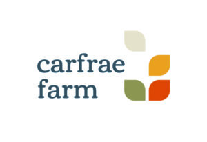
Carfrae Farm has evolved over the past six years, an arable farm at our core, but now also a destination for holiday makers and locals alike, with our luxury holiday cottages, wonderful farm shop, local activities and much more to come… So we thought it was time for a change, time for a logo that not only embodied the core essence of Carfrae Farm but could also scale with us on our journey of growth and development.
We reached out to Edinburgh-based Graphic Designer Janey Boyd and worked with her to develop ideas and concepts that felt natural for the development of our brand. Janey designed the logo to capture the character of the farm, its rich farming traditions and the array of activities on offer.

Janey says “The icon is a symbol of the cultivation of arable crops. The selected colour palette includes a deep grey-blue, seen in the slate and metalwork of the farm buildings, warm white and green for a natural and calming effect, sunshine yellow reflecting the vibrant crops, and a warm orange that gives energy and excitement. The typeface selected is a modern version of traditional style. The overall design captures the essence of the agricultural heritage and the new, high-quality experiences that Carfrae Farm provides.”
The coloured wheat symbols represent different elements of our brand:
![]()
Warm orange for our luxury holiday cottages and city apartments
Green for the unique local activities in nature we offer
Yellow for Carfrae Farm Shop which is bursting with fresh, local and Scottish produce
Cream is a watch this space…
We love our fresh new look and hope you do too!